DatePicker in JavaFX Tutorial
DatePicker in JavaFX is the same as the JavaFX ComboBox and JavaFX ColorPicker because this node or control uses the ComboBoxBase. The DatePicker is a ComboBox style control. When a user clicks the DatePicker, it will pop up a calendar. The DatePicker also allows the user to enter a date or select a date from a calendar.
How to use the DatePicker in JavaFX
From the word date picker, the user will select a date from the calendar and the date will display if you want to display it. The DatePicker is very easy to create and use; you just simply create an instance of the DatePicker constructor. In this tutorial, I will walk you through creating the DatePicker. We will also get the selected date and display it in the application.
You can create the date picker using its constructor. You need to create an instance of the DatePicker constructor, and you can also pass an initial date using the LocaDate. The following example below will show you how to create the DatePicker in JavaFX and will show more examples below.
Create the JavaFX DatePicker
Use its default constructor to create the date picker. You can also create the Date picker easily using the Scene Builder if you are developing an FXML-based application. See the example code below to create without using Scene Builder.
// Create a DatePicker with null as its initial value
DatePicker datePicker = new DatePicker();

//Create a DatePicker with an initial date
DatePicker datePicker = new DatePicker(LocalDate.of(2022, 8, 19));
Add to the Scene Graph
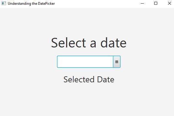
Once you have created the DatePicker in JavaFX, what you are going to do next is to add it to the scene graph. If you are not using the scene builder, you need to know how the layout in JavaFX works. Please see the following example below.
// create the date picker
DatePicker datePicker = new DatePicker();

// create the layout
StackPane layout = new StackPane();
Scene scene = new Scene(layout, 400, 400);
layout.getChildren().add(datePicker);
stage.setScene(scene);
stage.show();
Output
Get the selected date
When you select a date from the JavaFX DatePicker and wonder how you can get the selected date and display it in your application. You need to use the getValue() method to get the selected date. See the following example code below.
DatePicker datePicker = new DatePicker();
datePicker.getValue();
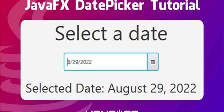
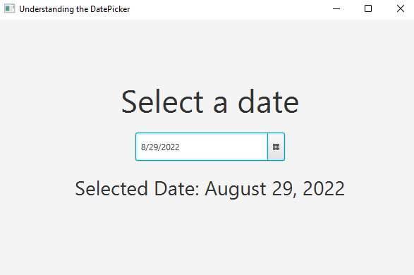
If you want your selected date to be something like August 29, 2022, you should use the DateTimeFormatter. Create an Action Event for your DatePicker and follow the example code below.
private void datePicker(ActionEvent evt){
    LocalDate localDate = datePicker.getValue();
    String pattern = "MMMM dd, yyyy";
    String datePattern = localDate.format(DateTimeFormatter.ofPattern(pattern));
    selectedDate.setText("Selected Date: "+datePattern);
}
Output
Editable DatePicker
The JavaFX DatePicker can also be editable. When you enable this feature, you can enter a date manually in the JavaFX DatePicker. Otherwise, you can’t enter a date manually when you disable this feature. See the following code below to learn more.
DatePicker datePicker = new DatePicker();
// users can't enter a date
datePicker.setEditable(false);
Styling with CSS
JavaFX has also the ability to allow Cascading Style Sheets (CSS). You can add an inline style or an external CSS file. If you don’t know how to add JavaFX CSS to your JavaFX application. You can click the given link to learn more about JavaFX CSS. The following example code below will show you how to add CSS codes to your CSS file.
/* Display current day numbers in bolder font */
.date-picker-popup > * > .today {
 -fx-font-weight: bolder;
}
/* Display all day numbers in blue */
.date-picker-popup > * > .day-cell {
 -fx-text-fill: blue;
}


